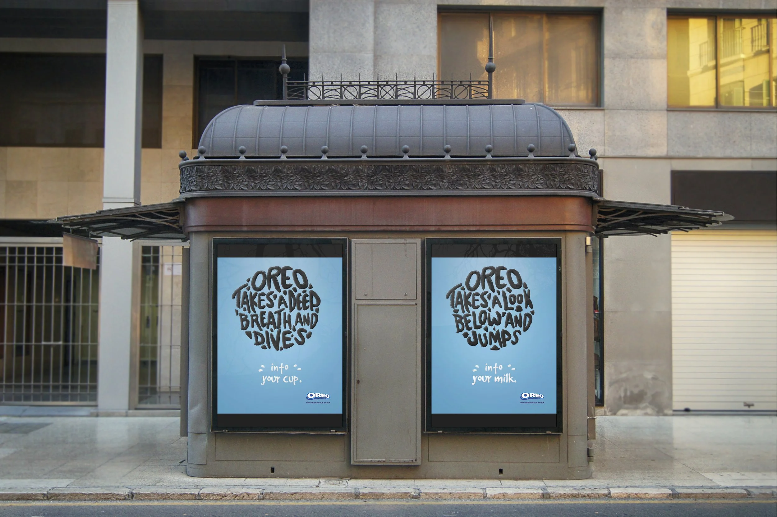
oreo typography advertising campaign ·
oreo typography advertising campaign ·
CATEGORY
Advertising Design, Typography
TONE WORDS
Distinct, Iconic, Universal
These are three umbrella concept advertisements to promote the iconic Oreo original cookie brand, with the constraints of utilizing typographical elements.
The overall visuals are inspired by the brand’s color scheme itself, and handwritten lettering. I used textured brushes and strategic shading to convey the feeling of milk and the cookie’s texture. The cohesive ads are meant to be used in a wide variety of media, including outdoor posters and magazines.


